A Designer’s Debrief: Lucy Mothersdale on the German Football Jersey That Rocked the European Championship
adidas Designer Lucy Mothersdale takes us for a deep dive into the world of designing football jerseys for federations.

Football has a way of interweaving itself into the fabric of local culture. Lucy Mothersdale might understand this sentiment best of all. Not only did she grow up not far from Liverpool, but she now plays a role in how seams come together.
While Lucy’s path into the football fashion world with adidas has only just begun, she’s already designed jerseys that turn heads on the streets and are tough to find in stores. Only when I spoke with her did I discover she’s one of the creative masterminds behind Germany’s pink showstopper. Here are some excerpts from our chat.
What’s your design journey been like at adidas so far? And when did designing federation kits enter the picture?
I joined the company three years ago, so I’m still relatively new to the adidas world. I started in football generic, working on base styles. My first season was maybe ’23, although my first major season was ‘24. Then, our team got tasked with federations as well. So, I moved into designing base styles and federation stuff, and now I’m working purely on federations. I’ve been on the same team since I started three years ago, but in slightly different job roles.
For the uninformed like myself, can you explain what working on base style in football generic is?
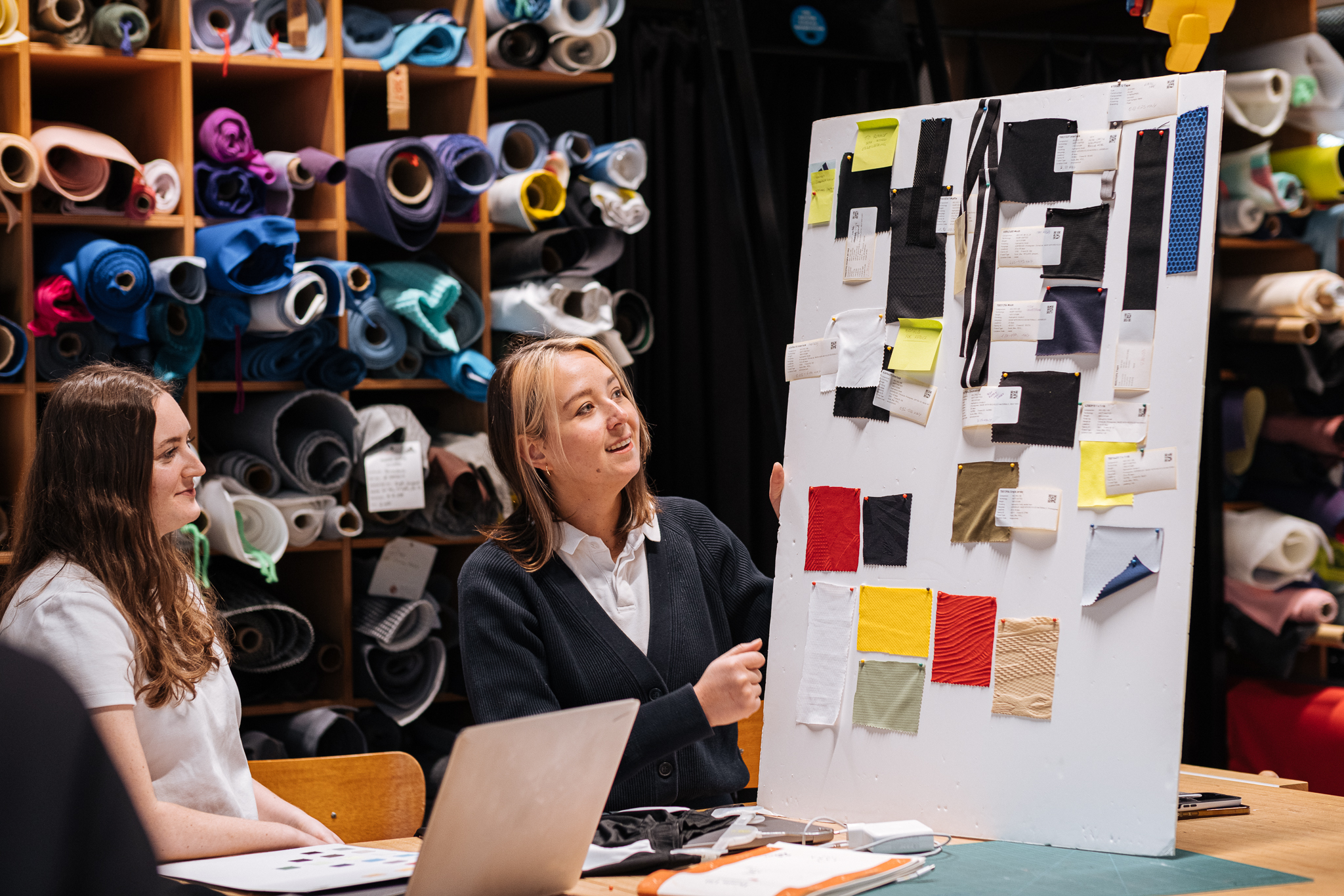
Football is split into a few different teams; I worked in two of those team since joining: generic and federations. Generic football creates the unlicensed product—like matchwear and training wear, for example. Here, the focus is more on the design lines, fit, and materials, right from the top performance products all the way to the accessible price point products. Then these products go to the licensed team to start their own design process, but at the same time, they also can be bought by local clubs and individual buyers.


Moving into the federation space sounds like a big transition. What’s your experience been like working on federation kits?
For me, it was a super nice experience to go from doing the base styles and apparel design to leaning more into the graphic side of things. And then seeing the whole process through, from creating the base style that is used for license and doing the licensed product on top of that. You see the whole garment creation from the start, where the patterns are being created, to the final product, where the individual stories for our clubs and federations are told and the specific licensed embellishments are added.
Which federations have you been working on?
My only one that’s out at the moment… I was lucky enough to work on the Deutscher Fussballbund (German Football Association) Germany ‘24 kits; I did the home and away jerseys for that. The rest of my projects I’ve worked on are not out yet—but I’ve worked on Algeria, Wales, and Spain - which are coming out in the future. We’ve also started working on the next World Cup where I’m working on Spain, Argentina, and Chile. It’s a nice mix.
Speaking of Germany, you couldn’t escape the pink craze at this year’s Euro Championships. It became an instant fashion statement. What was the inspiration behind the German kits?
For the German jersey, we knew there would be a lot of eyes on it. It was going to be a home Euro played in Germany, so there had to be something special about these kits. Then, we worked closely with the marketing team, and they helped provide the stories behind our jersey. So, for the home jersey, we wanted it to be German, with respect to the colors—so very traditional, but also modern with something new and fresh for Germany.
We wanted that German heritage to come through, but not in the same way as we’ve seen previously. So we accomplished that with the home jersey through the flag colors on the side and the fadings. I think it speaks to Germany, but it’s also got the boldness of the colors and the flag colors; they’re just a bit more saturated. It really brings a freshness and a slightly different look whilst not going too far from what Germany is as a football federation.

And then for the away jersey… that was kind of a big discussion. We wanted to do something new, but we didn’t know exactly what it was at the beginning. We wanted to play with color and we weren’t sure how to play with color. We collaborated a lot with our marketing teams and consumer research. We wanted something young; to appeal to our younger audience, and still, we wanted it to speak to Germany in some sense because, obviously, it’s a German kit.
It was about pushing the boundaries of what we could do with color and how to appeal to that Gen Z crowd and make a fashion statement. We wanted to do something that says, yeah, you can wear it in the stadium and support your team, but also you can take it out of the stadium and wear it to a festival, wear it on the street, and it won’t look out of place. So that was kind of what we did there.


What’s the connection between the home and away jersey?
The link between the two jerseys has to do with the graphics. On each kit, we’ve got this repeating diamond triangle motif that came from the eagle’s wing. It’s a classic symbol of Germany, and we wanted to bring that into the home and in the away jersey with it fading; that’s how the diamonds came into the design and how the away jersey had that link to the home one. So, it’s still German, just with a fresh new color palette.
And let’s not forget about the pink X-factor of the tournament.
We explored a lot of colorways. We looked at blue; we looked at green; we looked at purple—and this purple is what kept coming back up with our consumer validation. The 16- to 24-year-olds we talked to found the purple color really cool.
So we thought, okay, let’s see what we can do with that. We ended up with purple, and then came the pink. I was just sketching up until this point, trying to see different color combinations, which is when we added the pink, and it just kind of felt right. That’s how we ended up there, and it was a big risk. But I think in the end it paid off, thankfully.

Football jerseys are also becoming a part of street culture nowadays. How would you style them off the pitch?
I think with a pair classic Sambas or Gazelles. I like the pop of color you get in football jerseys and then the pop of color you get in a pair of Sambas or Gazelles. And just wear it with a basic pair of jeans or some denim. And yeah, I think keeping it simple is the important thing. A lot of football jerseys are super classic and stand by themselves, and then there’s so much variety in the jersey color and details.
Do you have any tips for the designers among our readers who might be interested in following your path to working with federations?
Yeah, I mean, I guess a lot of designers usually have a graphic design background—my background is slightly different.
I come from a fashion design background, so I started in apparel and then took it upon myself to become better at graphics. I started learning graphic design because I think that’s how a lot of people I work with have come into this area.
People come from all sorts of design backgrounds. I think graphics is the main one, though. We do a lot of graphics on football jerseys. And also, it’s good to have experience in a sports company or an interest in sportswear.
Yeah, so I think that’s most people’s path to federations: Starting with design and having any sort of design degree, probably graphics, and then just having an interest in football and sports.


